The Valuation Boost Needed to Justify YC Will Surprise You

My startup YesGraph just went through the Y Combinator Winter 2015 batch. (YesGraph helps your app grow. Check it out). I get asked all the time by folks that haven’t been through YC whether it was worth it. Many people that don’t understand fundraising and dilution enough to even calculate this. So let’s walk through the numbers.

Most people think: ok, they take 7%, so you need to be 7% more valuable to justify the investment. Maybe if you understand fractions, you know you need to be 1/(1-7%) = 7.5% more valuable to make it up. This is completely wrong math.

To match the dilution from their investment, you need to have a far higher valuation of your next round. Let’s walk through an example.

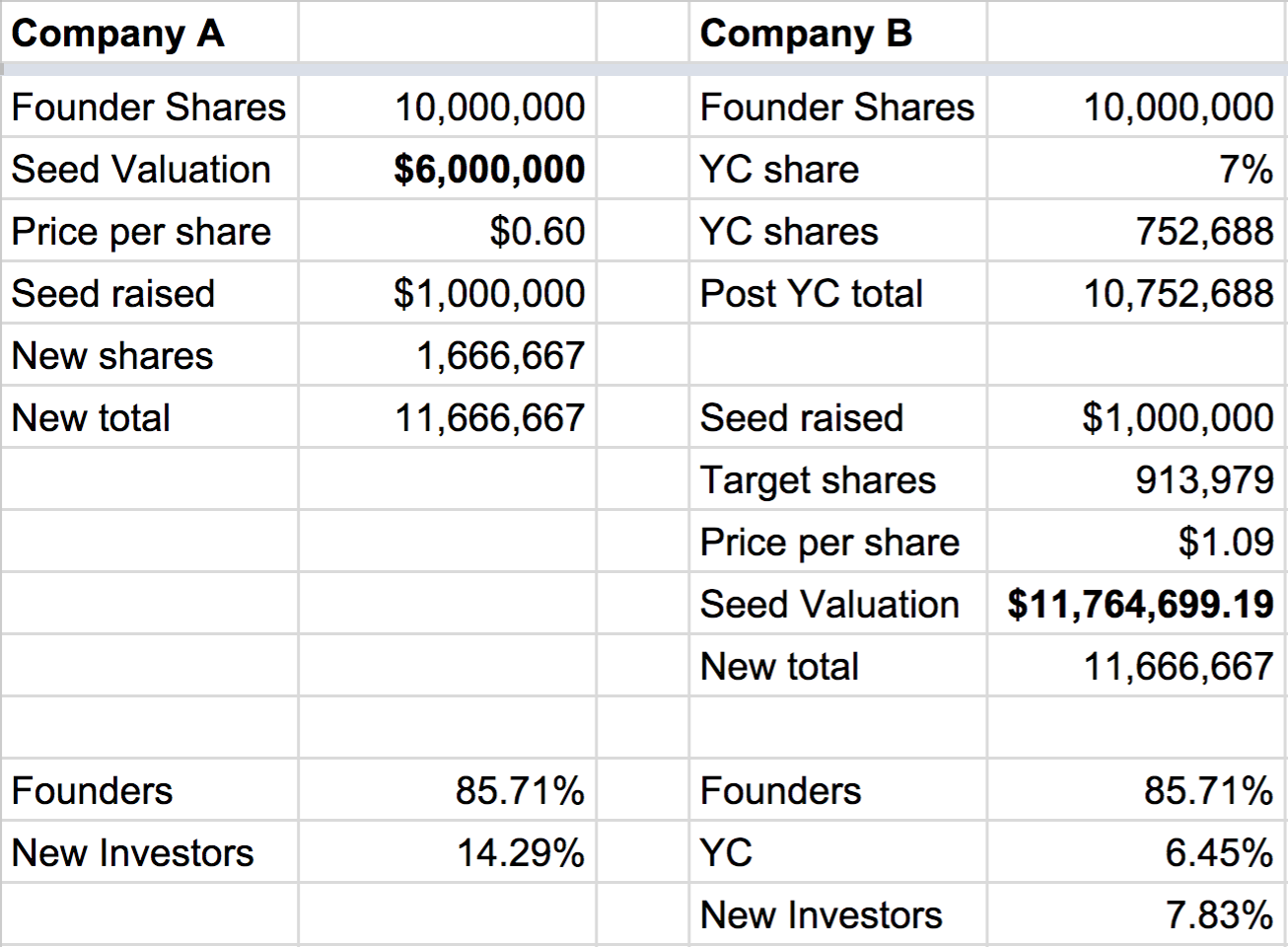
Company A doesn’t go through YC, but eventually raises $1M on a pre-money valuation of $6M. They will end up giving up  $1M / ($1M + $6M) in dilution, or 14.2%.

Company B does go through YC. So that means 7% dilution. Then let’s say that the company raises that $1M seed. What does the valuation need to be to hit 14.2% dilution total?

7.5% higher would mean around $6.5M.

Actually it needs to be $11.7M pre to reach the same dilution. That is a 96% higher.

Here is a table to illustrate why, and here is a link to the source spreadsheet. In short, to target the same total dilution, you need to give up less in the seed round.

Screenshot 2015-04-22 11.30.08

But this math is also wrong!

This assumes only one round. If YC makes your startup more valuable for your Seed plus Series A and Series B, then you can amortize the dilution across multiple rounds.

This gives a hint about why all this math is wrong. Sure, you have multiple rounds, but what is your real goal? You want your startup to win. You want it to be a breakaway success that makes a lasting impact in the world.

If you do, you are rewarded handsomely. This is why VCs have power law returns. The breakaway successes are worth 100X those that fail.

So how do we calculate value on a long enough time horizon, like 5 or 10 years? It turns out it is binary: did you win or not?

That valuation? That is really based only on the likelihood of winning. A $6M or $12M valuation is really just saying there is a 0.6% or 1.2% chance of being worth $1 Billion.

That changes the calculus. You might ask, are we 7% more likely to win? This is only a single shot, and not some statistical exercise with expected values over thousands of trials. So you could also round the question to: are we more likely to win?

I think the answer is unambiguously yes. This is a great rubric for thinking about your company generally. Are we more likely to win with this hire? Will this new product push make us win? Will this new investor help us win?

To be clear, the wrong choices for those questions can easily be a resounding, “No!”

There are negative hires. There are investors that suck. You make wrong product decisions all the time.

But the YC advice, the cred that it gives you, and, yes, the boost in your fundraising efforts, all make it a YES.


This was actually my second time through YC. I also went through in W08, and a lot has changed since then. If you want to get the next post about what changed since, subscribe here. And if you want your company to grow faster, go signup for YesGraph.


Why You Must Store Your Own Analytics Data

monk3Many companies get their analytics systems backwards. People love looking a graphs and performance dashboards. But analytics isn’t data porn. The fundamental purpose is to answer questions to help your business succeed.

At a young company, you probably don’t have all the analytics pipes setup. You should store your own data even at the very start. In this post I’ll explain why and the default way to get it done.

If you start sending event data to a tool like Mixpanel or Google Analytics, it means you can answer lots of questions. If you don’t need to write any code to answer a question, awesome! I love these tools and you should be using them.

Unfortunately. this doesn’t cover all cases. If you don’t control your analytics data, you’ll be left with a choice: answer with the tools you have or don’t answer at all. This is a poisonous problem for product teams — not just because you can’t answer the question immediately. It also changes the way you think about your data. You start to fear asking questions for the cost answering might incur. Your organization avoids answering hard questions, instead focusing on what is easy to answer. Poison.

If you have your own data, you can write a quick script to answer the question. Parsing analytics data with a targeted question isn’t the same as building a complicated dashboard. Building dashboards is a much harder engineering and design exercise than most people appreciate. So don’t do it — just answer your question directly with your analytics and user data. Once you do that a few times, you’ll start to build institutional know-how and tools around processing your own data. This is a virtuous cycle for startups.

I’d estimate around 50% of the questions I ask at YesGraph can’t easily be answered by our hosted analytics tools.

The Default Way To Store Data

There are lots of ways to get this done. I want to help you choose the most obvious way so you can get back to work. If your boss asks you, just tell them the growth experts at YesGraph told you to do it.

First, use Segment. They will help you structure your analytics events correctly. Segment lowers the cost of trying new tools, which can help you avoid. So you’re going to win by choosing them.

Next, implement their webhook. They’ll pipe data back through to your systems. You don’t need anything fancy at the start. A simple relational database can store your data. You only need to worry about scaling once your queries get really slow. Again, fear of the cost of answering a question will poison your culture into avoiding asking them.

If you have deep pockets, pick their enterprise tier and store the data in Amazon Redshift directly. Then Business Intelligence tools like Chartio and Looker can work directly off that data. You have your data, and better tools to analyze it. It’ll cost you money and save you engineering time.


Subscribe to get future YesGraph posts here. We routinely write about growth and issues around data and analytics.

YesGraph’s Pricing

YesGraph is just getting started, and you can use it for free. We won’t always be free, so here is how we think about pricing.

You should only pay for the value you get from YesGraph. YesGraph helps your app grow faster. So we’re going to do performance based pricing, where you only pay for growth attributed to our recommendations. Different applications have different value per user, and we’ll try to represent that. We’re experts in performance marketing ourselves, so we know what you’re looking for.

We also want to support small developers. Small apps don’t have huge volumes of data and small teams tend to be more self serve in onboarding a product like ours. So we want a freemium model to make sure that small developers and bootstrapped companies have a place on our platform.

Once this gets more formalized, we’ll write about it right here on our blog. If you have any questions or feedback about pricing, please email support@yesgraph.com


Subscribe to get future YesGraph posts here.

Growth Step #2: Build a Map

map

This is the second post in a series about how to grow. Click here to subscribe to new posts.

The first step to driving growth is picking a goal. Then you need to understand your product to know which areas might drive growth. It’s about finding your growth levers. You should refine your understanding until you have a clear sense of how any change might affect your metrics.

Guided By Actual User Experience

To start, put yourself in the shoes of a user. What is the very first thing they experience? They might land on your home page. They might get a message from a friend about your product. They might have seen your company covered in the press. Start there, and expand.

List all the places where your product touches the user. Include every page on your site and parts of your mobile app. It is also email, push notifications, SMS, and other messaging channels. Some pages are about communicating what the product does during onboarding, others are part of the product experience.

You can go deeper by making it stateful. Where is the user in their lifecycle, and how does that flavor the experience. Often you have multiple goals for a single page, and representing those constituents is really important. While conversion on a landing page might be direct, most experiences after signup and onboarding have diverse targets. Over time, you’ll build up a better understanding of what specific actions cause a user to activate and be retained. You can then prioritize those features.

Map To Your Goals

Break down your product to understand how each part influences your goal. You can dive down to a microscopic precision here, but many people don’t even get the satellite view.

Let’s walk through an example. Your goal is more active users. That isn’t directly actionable, so what are the components? You have new signups, retained users, churned users, and resurrected users. Every single active user or previously active user belongs to one of those categories.

Now go further. Where do your signups come from? Some from direct visits to your home page, some from invites from current users. Understanding signup source is the first step to improving signups. The same is true for the other categories: how do resurrected users come back?

Back to signups, again go further. Through what channels are invites sent? What are the conversion rates by channel? What is the message? Is that email subject good enough to open the message? Is the body of the email enough to make the invitee click? Does customizing the landing page improve conversion?

Finally you have something actionable. You can run a test on the email subject and body to see how it affects clicks, and then invite conversion, and then signups, and then active users. You’ve broken down a part of your product from an abstract goal to something actionable.

Think of it like an expanding tree of detail. Here is one pass, but you want to expand on everything:

Screenshot 2015-04-17 09.36.30

Now do this for everything, not just from the goals down but from the user experience up.

inception_paris

Include Uncharted Territory

The main challenge with this approach is that you focus on what is already there, but there is more to the story. You need to get creative and consider uncharted territory, things which you could be doing but aren’t. In the example above, you might be running a test on your initial invite. Are you sending a reminder? Do you reflect the status to the sender, asking them ping their friend directly? Do you use email when SMS might be more appropriate for your product? A good understanding of your product’s surface area should consider what isn’t there as much as what is.

Interestingly, when designers come up with possible implementations, they often have very different approaches. Too many times, I’ve seen these designs considered, filtered to pick one, and later on the product team is not sure what else to try. You already had variants, now just use them.

Too Much To Explore

It should be obvious once you break down your product that there is far more to improve upon than you can possibly do. If you’re running out of ideas, it means that you haven’t thought deeply enough about what you have and what it could be. The challenge becomes deciding on what to work on next. That is the topic of Step 3 in this series.

Just Getting Started at YesGraph

We recently opened up our beta API to the public on ProductHunt. The response has been wonderful, and it is amazing to see and try all the apps people are making.

Here is a brief tour of what YesGraph does, how it works, and how you can use it. I’ll try to keep it brief so you can get back to work.

YesGraph recommends who users should invite to your app. Here is an example. You’re tracking your running with an app like RunKeeper, and you want to share your awesome 5K. If you want to send it to a friend, you have to pick from hundreds of contacts, but there are just a few people that should really get it. Maybe they are close friends that live in your town that also like running. YesGraph can recommend those contacts, making sharing easier.

This improves the user experience and also boosts the performance of your sharing and invite flows. This helps your app grow and helps with each of the top actionable metrics for viral flows. YesGraph can help with referral programs, share flows, and social onboarding.

How do you use YesGraph? We have an HTTP API and a Python SDK and we’re working on adding more SDKs. If you want to help as we open source more tools, email support@yesgraph.com. See all YesGraph’s documentation here.

You send user contacts via POST on /address-book. Then you get the ranked contacts out via GET on /address-book. Tell us about your existing users via POST on /users. And tell us which invites are actually sent via POST on /invite-sent and /invite-accepted.

The historic users and historic successful invites are part of how YesGraph works. We can optimize future invites to match the past successful invites. So don’t skip these! And if you don’t already track invites on a per-invite basis, you should! It is a key way to know how well you’re performing.

YesGraph takes user privacy very seriously. It’s important to stress that your users need to grant permission to share their contacts with your app. Then you store them securely in YesGraph. We don’t share contacts and we’re not a data broker. This means that we can’t give you the users contacts if the user hasn’t shared them with you. For example, if you have a waiting list for a new app and only have the user’s email, and not their contacts, you can’t use YesGraph yet.

If your app is a mobile app, you should be getting access to the mobile address book. If you’re a web app, I recommend accessing the user’s email address book using tools like Gmail’s Oauth flow.

To give you a sense of how YesGraph works, there are lots of signals in the data. For example, social apps might often have users invite family members — and we can detect this by matching last names. Collaborative business applications might have users invite coworkers — then we can match company email domains. These are just two examples, and there are literally hundreds of other signals. We use machine learning to train a filter to weight these signals to optimize our ranking just for your app.

If you need any help with integration, please get in touch! support@yesgraph.com


Subscribe to get future YesGraph posts here.

Why You Should Stay Humble When Criticizing Other Products

Screenshot 2015-02-06 09.19.05

It’s easy to complain. People love it. It’s cathartic, and a small part of you probably thinks you’re helping make the world a better place.

When you have a bad product experience, there is a natural tendency to gripe about the design choices. The tone you take here is telling. Making products is really hard, but problems are often dismissed as having obvious solutions.

This came up in a recent interview we did with Samuel Hulick of UserOnboard.com. You can check out the podcast below.

At UserOnboard, Samuel critiques the onboarding experiences of popular products. In our interview, Samuel insisted that he tries to avoid saying something is right or wrong.

The reason? He’s not on the inside. He doesn’t know internal conversion rates and what really affects the user experience.

For example, he was looking at an app that asked new users to invite friends before getting deep into the app. Normally, this is a bad idea. It is (for most apps) the wrong time to be social. That caveat “for most apps” turns out to be important because in this case, it was wrong. After saying it was weird, the product designers got in touch and said “We hate it too! But it really helps users get engaged and retained”.

In this case, engagement and retention was improved by adding an invite flow. Go figure

For me, I’ve seen product design internals at Facebook and Dropbox. I’d often read stories from outsiders guessing about something internal. The stories were very frequently wrong. And it only takes a few such examples before you wonder if every story you hear about is wrong, from an outsider.

This annihilates trust. So if you want to keep credibility and maybe learn something new, keep an open and humble mind when critiquing products.

Check out this and the rest of our interview below. Subscribe to get future YesGraph posts here.

Samuel Hulick Will Save You (and Your Users)

At YesGraph, we’re all about growth. We’re obsessed. We talk to so many companies about growth that we think we can help in lots of ways.

Our new growth product can help, but there is a lot more to talk about too. So we’re blogging about metrics and growth. And now we’ll start interviewing growth experts and startup founders building the future.

Introducing YesGraph Office Hours

We’re really excited to start publishing some of our interviews. This first episode dives deep into user onboarding with Samuel Hulick. He runs the amazing site UserOnboard.com – you definitely need to check out his product teardowns. We also talk about his new product, available at UserOnboard.com/beta.

Help us Launch This Podcast

We have a few episodes recorded, and need to finish up editing. We’re actually not in iTunes yet. We’ve been told that to best launch a podcast, you want a few episodes queued up. You also want friends to leave positive reviews to make your iTunes launch go as well as possible.

So if you like this episodes, subscribe to get new blog posts and episodes in your inbox.

The plan is to get the community to subscribe and review on iTunes after a few episodes are available. If you have any other tips of launching a podcast, let me know in the comments or email me (ivan@yesgraph.com).

Another way to help is to spread this post. Things you can do:

  1. Tweet about it
  2. Share with Facebook
  3. Vote up the story on Hacker News
  4. Like the story on Quibb
  5. Vote up the story on GrowthHackers.com
  6. Vote up the story on Inbound.org

I’m new to this, and the best way to get better is to get feedback. Do I talk too fast? Too many “ums”? Should I have asked our audience for questions before the interview?

Add a comment or email me with anything and everything: ivan@yesgraph.com

Growth Step #1: Pick a Goal

We’re kicking off a new series on this blog. Starting from first principles, we want to outline how to grow. This is Part 1 of 5. This first post originally published on my personal blog about product and growth.

If you want to get the full series, subscribe to get future YesGraph posts here.


The very first step in growing your startup is to pick a goal.

It is surprising how often this isn’t mentioned as part of the process. When you hear people from Facebook’s growth team describe their process, they keep it simple: measure, test, deploy. This shows how deeply ingrained the growth ethic was at Facebook. Every employee knows they want the whole world on Facebook to the point that their advice skips goal setting.

To understand the importance of goal setting, just look at applications where the goal isn’t obvious for external observers. Before Twitter focused on monetization as a media company, they floundered with platform decisions along with the tension of getting regular users to publish vs consume. Is Foursquare a location API, a consumer local search utility, or a social network? This ambiguity is part of their current growing pains.

Deciding what the goal should be is hard. Startups are flooded with numbers: web traffic analytics, product event data, site speed & perf metrics, app store metrics, cohort data, and on and on. People see dashboards full of dozens of numbers, with additional complexity because you never just care about a number but also how it changes too.

wswisx0hbx0o4q

Which numbers matter? Let’s explore the different aspects of a good goal.

Stage Appropriate

Goals change depending on your stage. In this post by Brian Balfour about different stages for a company, he explains how retention is the most important metrics at the start, as a measure of approaching product-market fit.

Easy To Understand

People tend to have a hard time understanding graphs and complex statistics. Your goals should become diffused throughout your team, which means ease of communication is essential. The goal should be a single number, and it should be something people understand. Active users and revenue are two that come to mind that would fit most companies, and everyone understands them. This also helps in PR if you’re going to announce milestones with your goals, like Facebook announcing one billion active users.

Singular

It is really tempting to have multiple goals. Signups and retention both matter, right? The problem is that you need a guide to help prioritize your product pipeline. Ambiguity here can cause you to work on the wrong things. It also makes communicating goals harder.

No Bullshit

It is surprising how often you continue to hear statistics that don’t matter, like pageviews. Some call these vanity metrics, because they don’t map to what matters for your business. Companies often publish the number of signups instead of the number of active users, when obviously the latter is what really matters for most businesses.


Teams within a company can certainly have their own goals. I’d recommend that they all have the same characteristics as a company goal. Ideally, the relationship between the company goal and the team goals are well understood. A good example breakdown can be found in this post by Tomasz Tunguz about structuring a sales team and the associated metrics of each component.

For my new startup, YesGraph, we went through this process. We’ve built multiple products, so have been through it more than once. Our new product helps companies grow, so the only reasonable metric is how much growth we’re causing. How many quality signups can be attributed to our tools?

There are other metrics for YesGraph, like the number of developers, data scale, and revenue. The good news is that they are all going to be proportional. So when building a new product, we’re focusing on a key metric that doubles as a quality metric.

Step #2: Build a Map

Need help? Just ask YesGraph. If you want to review your metrics, you should email us at support@yesgraph.com or ask in the comments below. We obsess over picking quality metrics, and would be happy to help.


Subscribe to get future YesGraph posts here.


The Top 3 Actionable Metrics for Any Viral Flow

cockpit


So you want to optimize the virality of your app. What metrics do you pick? There are dozens of numbers to look at. If you’re feeling confused and overwhelmed, don’t panic. I’ve been there, having helped run growth at Dropbox where social invites through referral and shared folder invitations were a huge part of our growth. (psst, now I’m working on YesGraph)

You might be surprised that I’m not going to talk about “Viral Coefficient” or “K-Factor”. They lack a strict definition (hint: time bounds matter) and aren’t actionable. I’ve also noticed that people that talk in these terms often haven’t worked for a massively successful company. So don’t be that guy.

At the start, keep it simple. Here are the three metrics I like using.

  1. % users participating
  2. # Invites sent / user on average
  3. # signups / invite

Let me try to define each.


1. % Users Participating. At the start, you want to know how many people are even participating in the invite flow. This doesn’t mean they’ve sent invites, just that they are actively involved in the process. For example, visiting a referral invite page like dropbox.com/referrals could count.

I like this metric especially because it is usually surprisingly low. Many sharing features only have 1% or 2% of users participating in a given month. You can cheat a little and only measure the percentage of active users. That doesn’t help much, but it does make your numbers look better. Try to make the events meaningful. Just being on a page with a small “share” button shouldn’t count.


2. Invites Sent / User Participating. This can get tricky depending on your exact flow. You might, for example, want to track percentage of people that publish to Facebook (which is one to many) separate from email invites (which are one to one). Email invites tend to perform far better (10X conversion) than publishing a link to Facebook or Twitter, so it is ok to focus on how many are sent. If publishing dominates over invites, add metrics for % participants who publish and # clicks per published link.


3. Signups / Invite. This measures how many people signup per invite sent. Again the math can get tricky if you’re looking at published links vs direct invites. Conversion of an individual signup will be less than one. From publishing a link you can get multiple signups.

You can further refine each of these measurements. I highly recommend you get started with the basics to understand what is performing well and what isn’t.

At the top level you might attribute X% of your signups to a sharing or invite flow. But if you want to make that number go up, you need to know where the dropoff is.


Two Examples

With Yammer, the last time I checked, everyone that signs up is presented with an invite flow to get 5 people into the service. I don’t typically recommend prompting invitations before engaging the user, but some social apps require others before becoming compelling. Some of the invites might be low quality for people that just want to get in. This means the conversion to signup will be lower than expected.

Here is a guess at Yammer’s stats:

  • 100% of the users see the invite flow.
  • 1.5 invites per user.
  • 0.10 signups per invite.

The only reasonable place to focus your effort is on conversion of invitees. 10% has a lot of room to grow. Here is where this gets actionable. Run tests on the messaging. Send multiple invites. Run tests on the landing page. Prompt the inviter to send reminders.

Now take a mythical service that just started making a referral program, InstaJoy. The only user exposure to the referral program is a link at the top of the home page that says “Give $10 Get $10”. Sounds compelling, but what percentage of users are looking at the home page at any one time? And how many even click that. This is an example where not enough people are participating.

  • 2% of users see the referral page.
  • 0.5 invites per user
  • 0.25 signups per invite

In this case, what might happen if the service sent an email to all users to make referrals? Maybe 2% of people would click the call to action in the email. But that means ~4% of users see the referral page, effectively doubling performance. If they send another reminder email, another 1% might engage. That is another 25% increase in performance.

These metrics are simple yet actionable.


Again, you can get a lot deeper in every dimension. Don’t let perfect accuracy get in the way driving immediate improvements.

If you need help with your metrics, just ask us. We are obsessed with this data, and actually love dorking out about metrics. Just email support@yesgraph.com or find me on Twitter.


Subscribe to get future YesGraph posts here.

Radical Transparency: Here is YesGraph’s New Content Marketing Strategy

press room 2

YesGraph is embarking on a new direction, which changes our marketing audience and goals. I recently wrote up some notes on how we should use this blog and other marketing channels. Because YesGraph’s new product is all about helping companies grow, I thought the community would want to see how we think about part of our own growth.

Below is the internal doc I wrote, edited only for clarity for this blog’s audience. I’d love to hear what you think in the comments, on Twitter, on in email: ivan@yesgraph.com

Subscribe to get future YesGraph posts here.


This document lays out YesGraph’s new content marketing strategy. The goal here is to get a cohesive picture of what the next few months look like. We should also flesh out some of the challenges and ways to address them.

What Are Our goals?

This is not immediately a traffic and sales play. We don’t need to drive quantitative metrics. Part of that rationale is that our sales process is ill defined and we don’t have a launched product yet.

Instead, the goal is to impact a few different areas:

  • brand
  • pre-sales
  • recruiting
  • press

Brand. We want to establish YesGraph as the best place in the world to learn about how to grow your product. Our content should be world class and authoritative. We’ll do this by writing about what we know, and interviewing experts who know more than we do. When potential customers, employees, and investors do diligence on our company, this content will convince them we’re credible.

Pre-sales. People that want to learn about growth will be qualified leads for our product. Eventually, our content marketing will become part of our sales machine. At the start, I just want to talk to more people that might be customers. This is still an early customer development stage, and funnel optimization for sales isn’t as important as building an amazing product.

Recruiting. We only have a few customers that are live with our API. We don’t have a good demo to show. We also haven’t made any noise in the press. All of this combines to make recruiting harder because convincing people to join our company comes with no background on what we’re about. What we write will showcase what we’re all about. YesGraph can help your company grow. This is an incredibly high leverage position, helping multiple companies at once. It’s also a complex engineering challenge. We have everything we need to convince people to join, and this content is going to help get the word out.

Press. We’re telling an outlier story with YesGraph. We are experts building something every developer needs. It is core to their business, and doing it yourself is hard and won’t work as well. Part of telling this story is showing it. The content we create will help us tell our story to the press. The content itself might be a story too. Our product helps customers, but there is so much knowledge that can’t be productized that we’re writing about it as openly as possible. This fits a good narrative because we’ve already blogged successfully about growth and also about startup ideas.

What Is the Format of the Content?

There are three formats: blog posts about growth, interviews with people about growth, and office hours with companies.

Blog Posts will match others we’ve written on blog.kirigin.com and blog.yesgraph.com. Some examples:

Each of these are thoughtful posts of moderate length covering an aspect of growth. Some are more tactical, others are more strategy.

Interviews are ways of creating compelling content without the overhead of writing clearly. Plus people we interview have their own audiences which can help with the promotion. Most importantly, getting people in the trenches working on growth to tell their story will likely product some really compelling content. Some of the content might be expanded into blog posts.

The format for the interview could be a phone call that is recorded and whose transcript is published as a blog post. Video interviews have the most overhead of production costs but also can make really compelling content.

Office Hours are all about directly helping a startup. We’d cover their goals, what they’ve tried so far, and what they might be able to try going forward. They’ll be recorded phone calls and maybe video calls. The format, like interviews, is better with video but that comes at higher costs.

An issue here is transparency, where maybe companies won’t want to reveal some information. It is most important to get to the truth in office hours, so we’ll allow companies to redact some questions

At the start, our pilot customers make great candidates for interviews. I routinely respond to requests to chat about growth, so the logistics of setting up office hours is really just recording what I’m already doing.

[ed: if you want help with growth and like the idea of office hours, email me ivan@yesgraph.com]

Where To Start?

This outline might make a good blog post. Starting by writing more on our blog is the easiest. Then in parallel we can setup interviews and work through the format.

We should also setup www.yesgraph.com to say the right information about our company, and other such details about capturing an audience.

I have an Asana project with blog post ideas. We should flesh out a few posts to help triage which might be the best to get out soonest. We can double the project to include tasks to setup the blog. I probably won’t go so far as to develop a content schedule besides a frequency baseline: 2 posts per week.

For interviews, I should reach out to a few friends working in growth. For office hours, I should start with companies I already know.


That is it for our internal strategy. Since writing I’ve discussed it with a few others and have refined the plan.

One new addition is a metric to track. Subscriptions to our mailing list is the easiest to track, so go signup here if you like the post: http://eepurl.com/LdRFj

If you have any feedback, let me know in the comments, or get in touch: ivan@yesgraph.com